In my last article, “How Native Tablet Applications Can Inspire Better Tablet-Optimized Websites”, I outlined several principles from native apps that can be leveraged to improve browser-based web experiences on tablets.
As an example of the experience gap between many browser-based web experiences that haven’t been optimized for tablet use and native applications on tablet devices, let’s take a look at the A&E TV web vs. iPad experience to determine which experience better facilitates user tasks on a tablet device. For those not familiar with A&E, it is a United States-based cable and satellite television channel with the tagline: “Real Life. Drama.”
While research should be done to validate A&E’s users’ needs, let’s assume that A&E’s digital content is likely frequently accessed by people sitting on their couches in front of a TV. These users likely want to find out more information about the shows, catch up on shows they missed, and find out when they are on. Under these general assumptions, does the A&E website or native tablet app deliver a more usable and enjoyable experience?

The A&E Web vs. App Experience
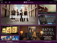
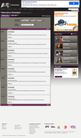
- Focus: The application’s initial screen focuses on featured shows of interest in a way that is very scannable. The screen invites exploration without coming across as overwhelming. The initial web homepage experience, in contrast, features only 3 shows in a distracting rotating header space and then fills the page with some scheduling information, video content, web exclusives, top shows, and callouts to other sections of the site (not to mention plenty of adverstising). The web homepage distracts from the core user tasks, whereas the focus of the native application makes the core information immediately apparent.
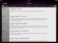
- Navigation paths: The native application focuses on content of most interest to its users: featured shows, all shows, and recently added content. These paths are large and easily accessible. The web experience uses a heavy navigation schema that doesn’t make the key paths immediately obvious. Secondary navigation is difficult to select, as it hasn’t been optimized for touch input, and some of the sections even direct the user to content not available on tablet devices.
- Actions: A&E’s native application makes key actions accessible at all times including viewing the schedule, adding an item to a watch list, and search. Additionally, actions that are contextual to individual content items are prominently displayed consistently across the experience. In contrast, actions on the website are more difficult to find and are spread out more inconsistently throughout the experience.
- Information views: The A&E app progressively reveals content instead of relying on full page transitions to view show information or to preview videos prior to watching. This helps to simplify the experience by progressively revealing information as needed. On the website, pages are more content-heavy and full page refreshes are required to access much of the content.
- Transitions and animations: The native application uses subtle transitions and animations to enhance the overall feel of the experience. Tiles with featured shows flip into view, a small “+” sign animates when shows are added to the wish list, and subtle animations are used within the channel schedule. In contrast, the website feels like a more flat and static experience with the absence of subtle animations. Full-page transitions and refreshes make the web experience feel more linear and less immersive as compared to the native app.
One may argue that A&E’s native app purposefully only focuses on a subset of the content available on the web. The app is more media-centric, choosing to focus on video over other content. However, A&E’s audience likely has fairly consistent content needs across the web and native experience when using a tablet device. Through research, A&E may be able to determine how to better present their web content in a way that doesn’t take away the full breadth of content but rather better prioritizes content that is most important to their users.
By presenting the user with a desktop-oriented experience on their tablet browser that hasn’t been optimized for tablet use, A&E may be losing an opportunity to engage users who attempt to interact with the company’s content in a browser. But by aiming to optimize their website for tablet use, A&E may be able to evolve their web experience to better suit users on both desktops and tablets.
“Download Our App!” Disrupts the Web User Experience
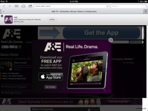
A&E Download App Popup
A&E must have some awareness that their native application delivers an overall better experience on tablets, as they employ a disruptive popup upon the user’s initial visit that tries to direct you over to download the application. This technique is a clutch that doesn’t recognize that users are accessing the content through a browser for a reason, and desire to engage with content without needing to download an app. Prompting users to download an application can be a very disrupting experience that could end up preventing users from accessing any of the company’s content.